Dashboard layouts
Tabs and groups
To configure the dashboard nodes, select the node to drag to the working area and double click the respective node to configure.
The tabs in the sidebar help you to re-order the groups and widgets. Also, you can add and edit their properties as per requirements. The detailed explanation of dashboard nodes configuration is given below.
Node properties
Some of the important node properties are described below:
-
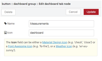
Tab: Tab is created under dashboard tab. You can add and edit groups and edit the group properties under the tab. You can add or edit multiple groups in the tab. The following user interface shows all the node properties of VFC dashboard related node:
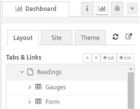
- In "Readings" tab, you can add one or more "Groups" like "Gauges" and "Form".
- Each "Group" can be configured with multiple dashboard nodes.
- Tabs provides the optional navigation level, as shown below:
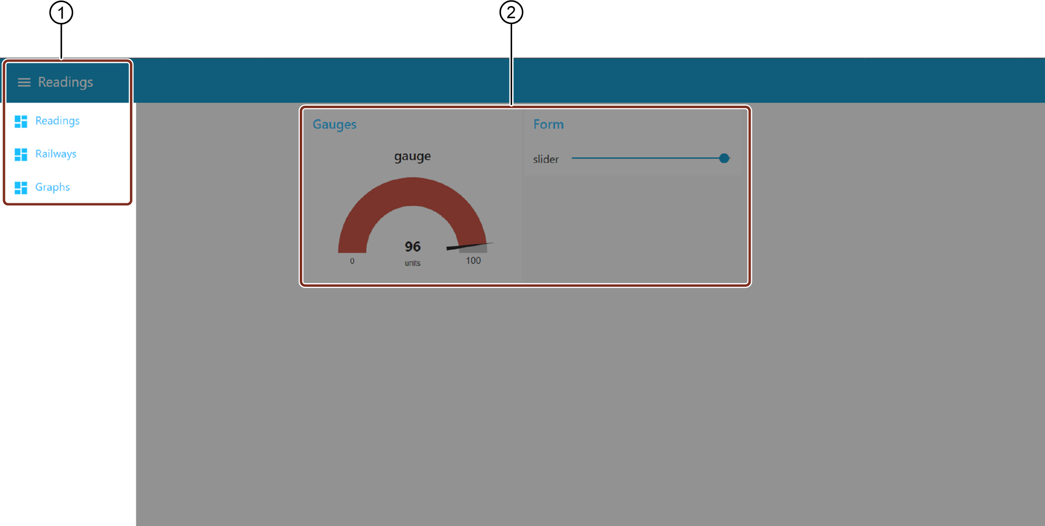
① Tabs on VFC dashboard
② Groups on VFC dashboard
- Groups are displayed next to each other (in case more than 1 group is configured)
-
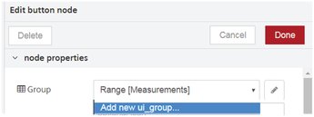
Group: A group is a container for multiple dashboard elements. To create a new group, select "Add new ui_group" from the shown drop-down menu.
Name the UI group. Thereafter configure the tab by selecting "Add new ui_tab" from the drop-down menu.
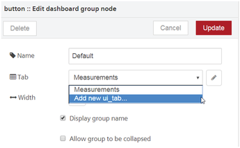
Configure the UI tab width and name the UI tab.
The tab and group of the node will be now configured. You can also create groups in the sidebar. For more information, refer to Create groups in sidebar.
-
Access: Choose the option "Show in Dashboard Viewer and OI" or "Do not show in Dashboard Viewer and OI":
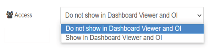
- Show in Dashboard Viewer and OI: The dashboard will be displayed in "Dashboard Viewer" and "Insights Hub Monitor".
- Do not show in Dashboard Viewer and OI: The dashboard will not be displayed in "Dashboard Viewer" and "Insights Hub Monitor".
-
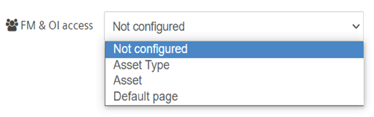
OI access:It is allowed to display the dashboard for an asset or asset type in "Insights Hub Monitor". For more information, refer to Dashboards chapter in Insights Hub Monitor.
Note
The “Default page” will display the dashboard on the selected tab within the tenant.
5.Size: The grid layout defines the height and width of the widgets as the size of the group. By default, 'auto' is defined as the group size, but you can always set the size to a fixed number of units according to requirements. To understand the size configuration refer to Example on size configuration.
6.Type: This is an optional property wherein you can select the working type to design a node.
7.Icon: The node's icon is defined by its property.
8.Label/ Name: This is an optional property. The label can be defined with a new name which will be displayed as the name of the node to the user.
9.Value format: Define data format if necessary.
10.Units: Define a unit if applicable.
11.Color: This is an optional property. You can set the icon color that will be displayed in the output.
12.Background: This is an optional property. You can set the background color as per requirements.
13.Range: This is an optional property. You can define a range by setting minimum and maximum values.
14.Topic: The topic field can be used to set the msg.topic property that is output.
15.Check boxes:
- If message arrives on input, pass through to output: Selecting this will set the value to true. You can refer to Example on message input passing to output for a clear understanding.
- Only one browser: If this is selected for a node in a flow, the node will handle each of the dashboards separately. For each browser, the communications originating from the node will be exclusively handled.
If "Only one browser" is not selected, the node will share all the dashboard communication with every open browser from that user. For more information, refer to Example on usage of one and multiple browsers.
Link and its node properties
The link in the dashboard tab helps you to add the links to the dashboard. Also, you can edit the properties to assign a link to display or access from the dashboard. Some of the important link node properties are described below:
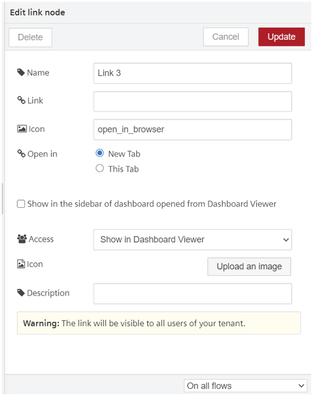
- Name: Enter the name of the link node.
- Link: Enter the link to open from the dashboard.
- Icon: Enter the name for the icon of the link node properties
- Open in: Choose "New Tab" or "This tab" to open the link in the new or current browser.
- Show in the sidebar of dashboard opened from Dashboard Viewer: It is a check box option, to access the link from the sidebar of the dashboard while opening from "Dashboard Viewer".
Note
If you uncheck the box, the link from the sidebar of the dashboard while opening from "Dashboard Viewer" will not visible. But it will be visible in the list of sidebar while accessing from Visual Flow Creator dashboard.
6.Access: Choose the option to "Show in Dashboard Viewer" or "Do not show in Dashboard Viewer". 7.Icon: Upload an image for the link node to display it in "Dashboard Viewer", if required. 8.Description: Enter the description for the link node, if required.
View dashboard nodes output
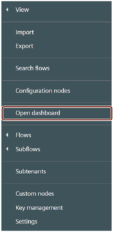
Once a flow is created, save it to deploy. Click the menu button  and then select "Open dashboard".
A separate browser tab will open where you will be able to view the dashboard.
You will be redirected to "https://visualflowcreatorURL.yyy.mindsphere.io/ui/dash/?user=username@email.com#/0".
You can open the dashboard of another user in his environment by defining user=username@email.com.
The tab menu will be visible on the left of the dashboard UI.
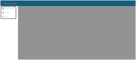
Select the configured tab to view your dashboard screen.
Note
- You can view the dashboards of other users in the tenant.
- The user's dashboards are automatically available for another tenant's user.
Hide dashboard application title bar
You can hide the application title bar to increase dashboard view.
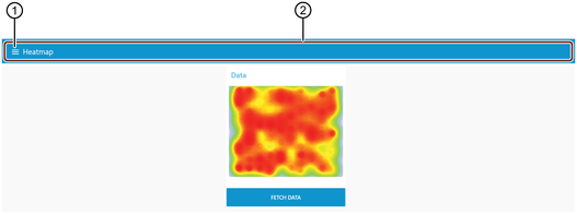
① Dashboard tab menu
② Application title bar
You can select "Hide title bar" to hide the application title bar in dashboard tab node properties.
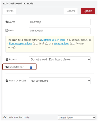
In this case, dashboard tab menu is not available to change the tabs.
Other methods to configure dashboard nodes
You can configure the layout of the dashboard by using the "dashboard" view on the sidebar. To learn more about configuring tabs and groups using sidebar, refer to Configuration of dashboard nodes in sidebar.