Visualizations
Visualizations play a pivotal role in understanding and interpreting data, providing for comprehensive analysis and decision-making. This section provides an overview of the various visualization panels available within Dashboard Designer, empowering users to explore, configure, and optimize visual data analysis.
Note
While this topic covers all Dashboard Designer Add-On visualization panels, please note that there are various packages and not all visualization panels are supported in all subscriptions.
Some Navigation Pointers for the Visualization Panel
This image illustrates the visualization panel with the sections collapsed. The multiple sections and settings allow you to tailor the appearance and behavior of the visual elements to suit your requirements. The image also shows a miniature version of the drop-down list that makes it easy to switch visualizations.
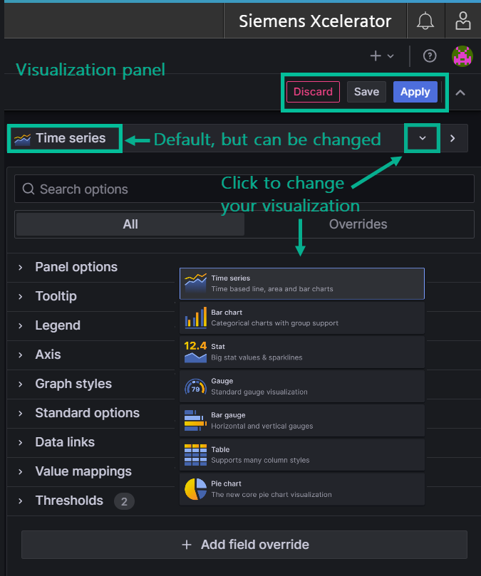
Visualization Panel Overview
The Visualization Panel serves as a hub for configuring and customizing different visualization options. Each section holds specific controls with default settings that are automatically applied unless you opt to make changes to fine-tune your visualization.
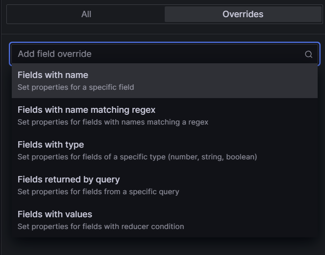
About the Overrides Tab
You can override settings for any visualization field. Here is an example that illustrates categories of fields you can search by to locate the field you want to override:
How to Configure Visualization Options
The following section guides you through configuring each visualization area. The number of settings you configure in a section displays next to its heading label.
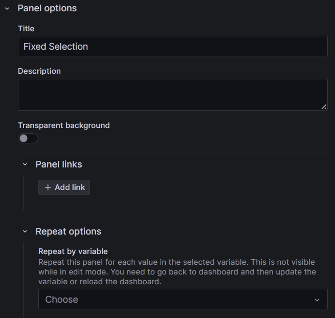
Setting Panel Options
The first section, Panel options is where you define the panel title, description, transparency, and include links, among other preferences.
The repeat feature allows Dashboard Designer to repeatedly generate a separate panel for each variable contained in an asset or aspect.
Follow these steps to configure the panel options:
- Enter a title for your panel. Optionally enter a description.
- If you want the background of the panel to be transparent, set the toggle to "on".
- Click the '+ Add link' button to enter a link title, the URL, specify whether or not to open the link in a new tab, and save.
Tooltips
Configure visibility, sort order, and other tooltip-related settings.
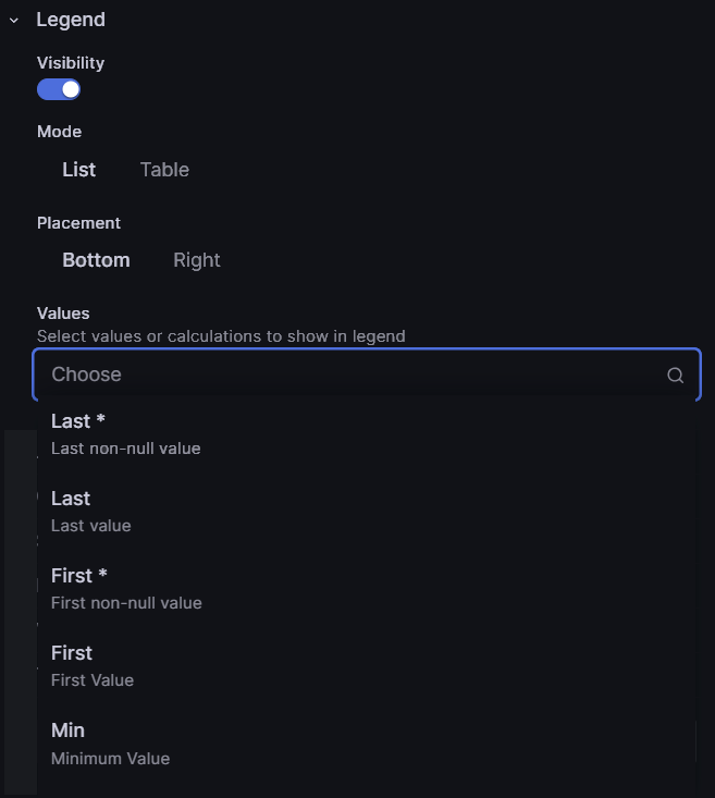
Legends
Tailor the display and positioning of the legend, choose list or table format, and select specific values to appear in the legend.
Follow these steps to set legend options:
- Toggle the visibility to 'on' to display the legend on your visualization.
- Set whether to display the legend as a list or table and whether or not to place it at the bottom or right of the visualization.
- If you want to display values in the legend, select the values you want to show from the drop-down list. Your selections display in the Values field as you choose them.
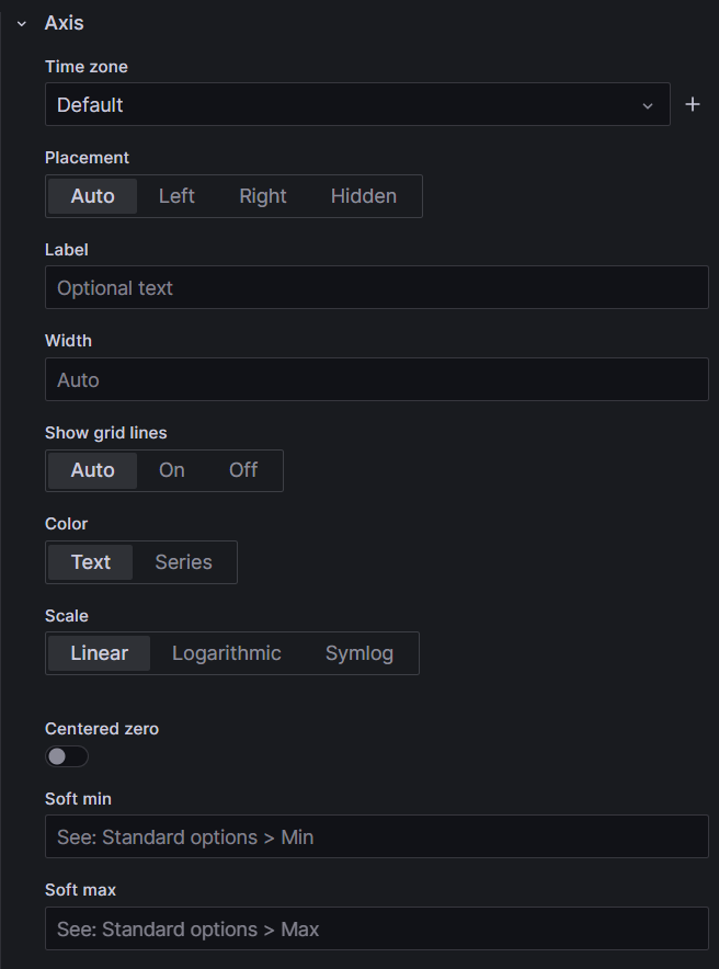
Axes
Adjust visual aspects such as placement, color, grid lines, and more, related to the axes.
Here is an example of the axis settings:
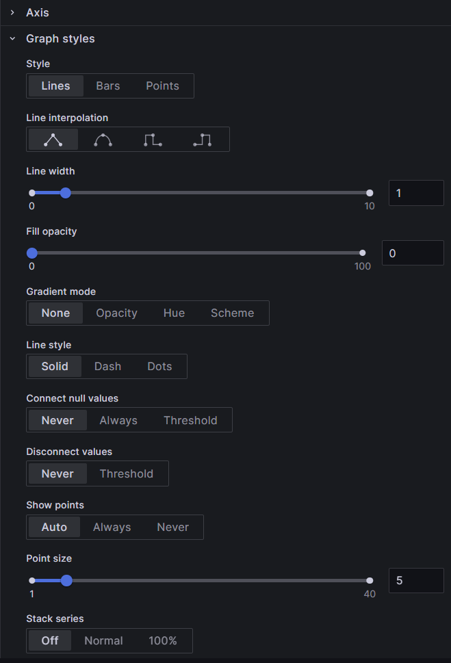
Graphs
Modify graph styles, including lines, bars, points, line characteristics, color, and additional visual options, as well as choosing whether or not to show various visual options for your graph.
Here is an example of the graph style settings:
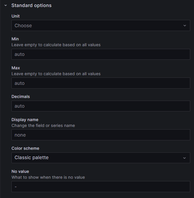
Standard Options
Customize various fields affecting the panel's appearance, such as units, color palette, min-max values, decimals, etc. Most of the fields in the standard options are discretionary and determine how your panel appears. The first selection, for example, is for the unit in which graph or chart data will be rendered, followed by the measurement standard, such as degrees, arc minutes, etc. for the selected unit. Other standard selections include color palette, min, max, decimals, and so on.
Follow these steps to set standard options:
- Select a unit from the drop-down list. A list displays various measurement standards for the unit.
- Select the measurement to use.
- Continue to accept the defaults or make selections for the rest of the fields for your visualization.
Here is an example of the standard options:
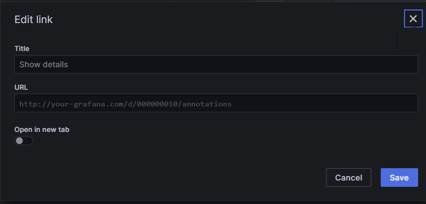
Data Links
Add and configure links to external resources relevant to the visualization.
Follow these steps to set data links:
- Click the '+Add link' button. The 'Edit link' pop-up window displays.
- Enter a title that will display on your panel.
- Enter the URL for the link - according to the example in the URL field.
- If you want the link to open in a new tab, move the toggle to 'on'.
- Click the 'Save' button.
Here is an example of the data links pop-up window:
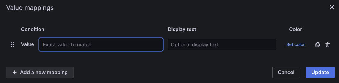
Value Mappings
Assign specific colors and optional text to render values in the data set.
Follow these steps to set value mappings:
- Click the 'Add value mapping' button. The 'Value mapping' pop-up window displays.
- Enter a specific value in the 'Condition' field.
- If you want the value to display in color, click the 'Set color' link. A color palette displays.
- Select a color.
- Contine to add additional mappings by clicking the '+Add a new mapping' button.
- Click the 'Update' button.
Here is an example of the value mappings pop-up window:
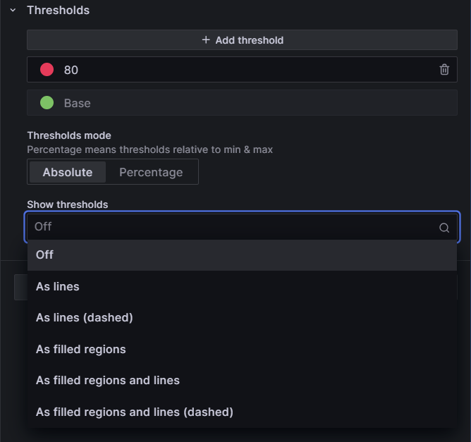
Thresholds
Set thresholds for values and define their display preferences, including absolute or percentage-based and visualization options.
Follow these steps to set threshold options:
- Click the '+Add threshold' button. A threshold row appears at the top of the thresholds list with a default value and color.
- Enter a number to replace the default value, or use the up/down arrows.
- Click the default color dot and select a color from the color palette.
- Select the delete icon to delete any threshold rows you don't want.
- Leave the 'Threshold mode' on 'Absolute', unless your threshold values are relative to min and max values; if so, slide the toggle to 'Percentage'.
- Select how you want the threholds to display from the 'Show threholds' drop-down list. (See image below).
Note
The 'Base' threshold row cannot be deleted.
Here is an example of threshold options:
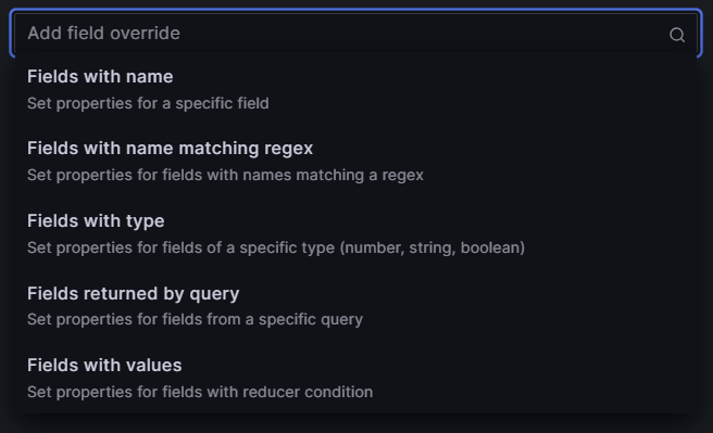
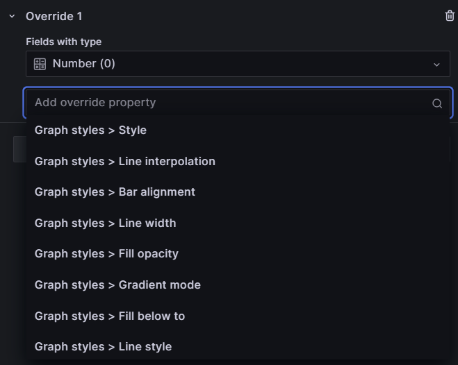
Field Overrides
Specify overrides for specific fields or field types, allowing for fine-tuning according to the data properties and queries.
Info
The following step-by-step uses 'Fields with type', then 'Number'. The steps are the same for any of the 'field types' you select. The subsequent drop-down list displays properties relevant to the field type selected. All field options that display for this feature are, of course, relative to the query data.
Follow these steps to configure the field override option:
- Click the '+Add field override' button. A drop-down of types displays. (Image below.)
- Select 'Fields with type'. The drop-down list closes and a 'Fields with type' label displays over a drop-down list of field types.
- Select 'Number'.
- Click the '+ Add override property' button. (Image below.)
- Select an option from the 'Add override property' drop-down list.
- Select and option from the additional values that display.
These images show examples of the field override options: