Getting Started
Prerequisites
Before starting, please make sure you have:
- Editor/admin access to Dashboard Designer
- Some asset data in your current set-up
Dashboards
Dashboards give you an at-a-glance view of your data and let you track metrics through various visualizations.
Panels
Panels are the main component of dashboards and are laid out like blocks on a grid. Each panel consists of a query and a visualization. The query defines the data and the visualization defines how the data is presented.
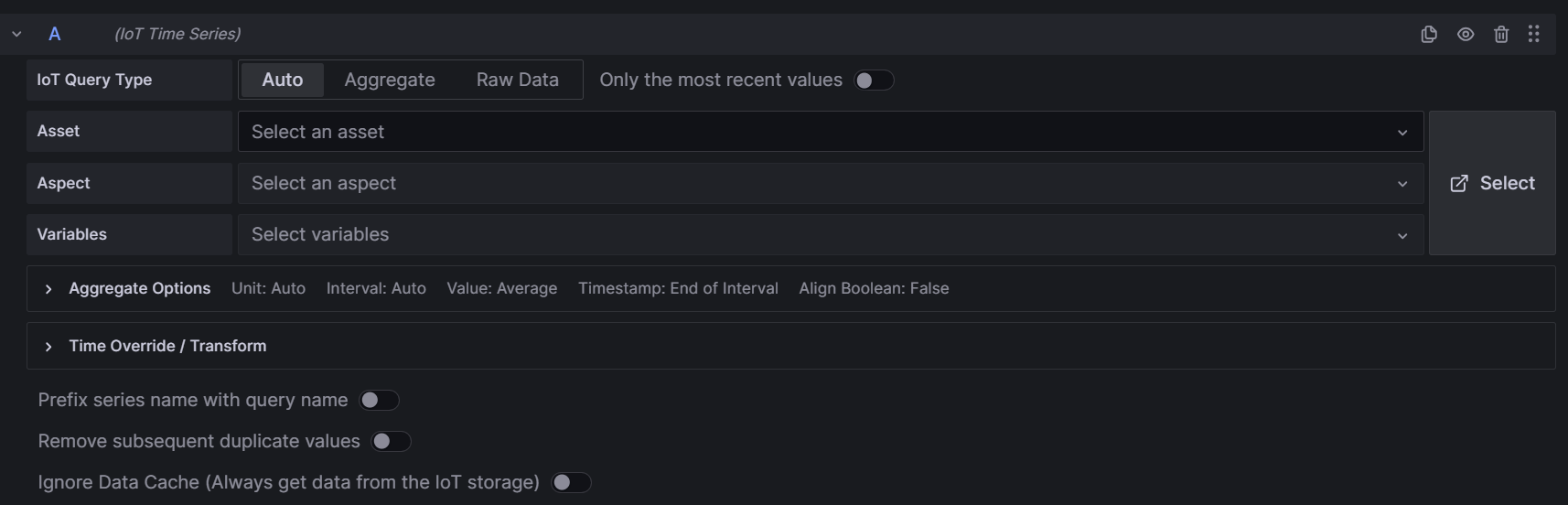
Queries
A query retrieves specific data from the data source. Use the query editor to select the specific data you want to use in your panel and add additional options like aggregation, time overrides, or transformations according to your objectives. See the Creating Dashboards topic for details.
Here is an example of the query editor, in which an IoT data source has been selected:
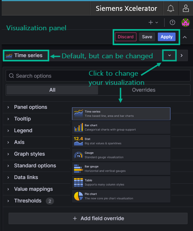
Visualizations
The Visualization Panel provides tools for configuring and customizing the many visualization options available. It offers multiple sections and settings for tailoring the appearance and behavior of visual elements to suit your analytical requirements. Visualization panel options include specifying virtually all elements related to a dashboard, from tooltips to value mapping and field overrides. With Dashboard Designer's responsive user interface, you can instantly see how different visualization selections change the data representation. Additional options include linking to other Dashboard Designer data, setting thresholds, and mapping values with text and colors. See the Creating Dashboards topic for details.
Our diverse visualization options enhance data analysis capabilities, and enable users to more effectively present, interpret, and draw insights from their data.
Here is an example of the visualization panel options:
Best Way to Get Started
Open two pages of Dashboard Designer side-by-side and experiment with the query editor and visualizations. Any selections you make instantly reflect in the visualization, so it is a great way to get to know how your choices affect the display of your data. You can also configure your data, then try various visualizations until you find the best way to show your data. Then try the visualization panel, which presents choices for every aspect of the visualization from legends to tooltips.
Pointers for Getting Started
Here are some helpful pointers for getting started:
- Data sources: the data source you want to use in a dashboard must be added to the dashboard first. See Prerequisites in the Creating Dashboards topic for details.
- Explore: use the explore feature when you just want to explore data without creating a dashboard. You can always turn your exploration into a dashboard.
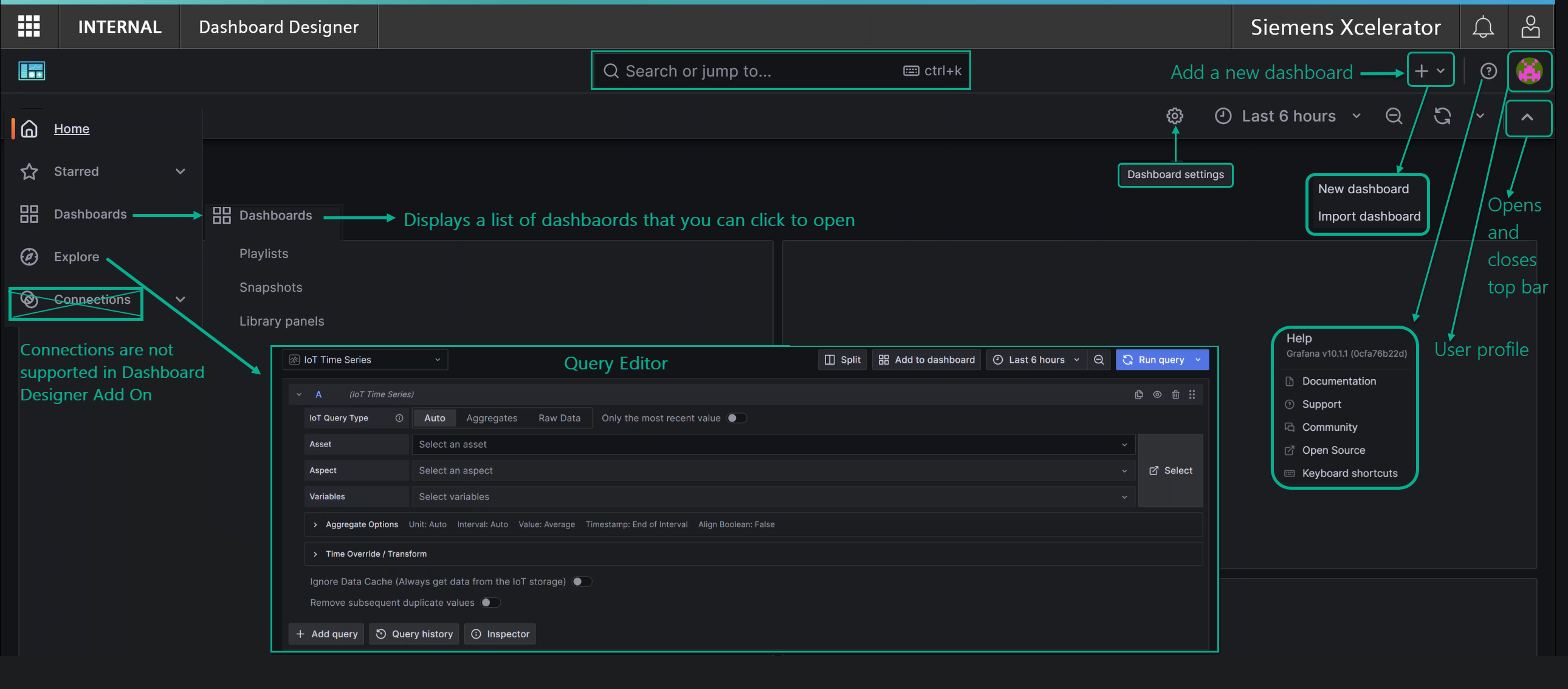
- Dashboards: the starting point for creating a dashboard is the "+" icon in the upper right, as highlighted in the image below. If you don't see the + icon, click the caret in the top row to open the top bar.
- Alerts: click the bell icon at the very top right to view or manage notifications.
- User preferences: click the human icon in the very top right, then click 'User Preferences' to open the Settings app.
- Logout: log out of Dashboard Designer by clicking the human icon, then selecting 'Logout'.
- Search: clicking in the search bar displays a list of dashboards, actions, pages, and preferences for quick navigation.
This image shows some icons, information, and navigation pointers on the Dashboard Designer main page: