Creating Dashboards
Creating informative and visually appealing dashboards is pivotal in modern data analytics. Dashboard Designer offers a robust toolkit with a comprehensive data querying editor and a rich assortment of visualizations that provide at-a-glance insights into data metrics. This topic serves as a guide to creating dynamic dashboards that effectively represent complex datasets in visually compelling ways.
With an interconnected and comprehensive dashboard experience, you can:
- Import dashboards
- Link your dashboards to internal and external Internet locations
- Copy panels from other Dashboard Designer dashboards
- Add links to other Dashboard Designer dashboards
Info
Only Admin and Creator users can create dashboards.
Overview
There are three areas to configure when you create a new dashboard:
Data source--select the data source to use for the dashboard.
Query--select which data from the data source to use, and optionally add a transformation to the query results.
Visualization--select options for visualizing the query results on a dashboard panel.
Info
Dashboard Designer includes a predefined set of data sources and does not support adding additional external data sources.
About Internet of Things (IoT) Time Series Data sources
IoT time series data represents measurements of a physical asset's property taken at regular intervals over time; visualizing the series of data points makes it possible to see trends, patterns, and anomalies in the 'big picture' data.
This topic uses the IoT Time Series data source to introduce and walk through the steps in creating a dashboard, but you can use these steps for any of the predefined data sources. Bear in mind that data sources use different types data and each displays their own unique settings in the query editor and visualization panel.
Hint
Go here for details on how rate limits may apply to your time series data sources.
Prerequisite: Add the Data Source to the Dashboard
First, you have to add the data source to your dashboard. This image shows how to navigate the data source selections described below:
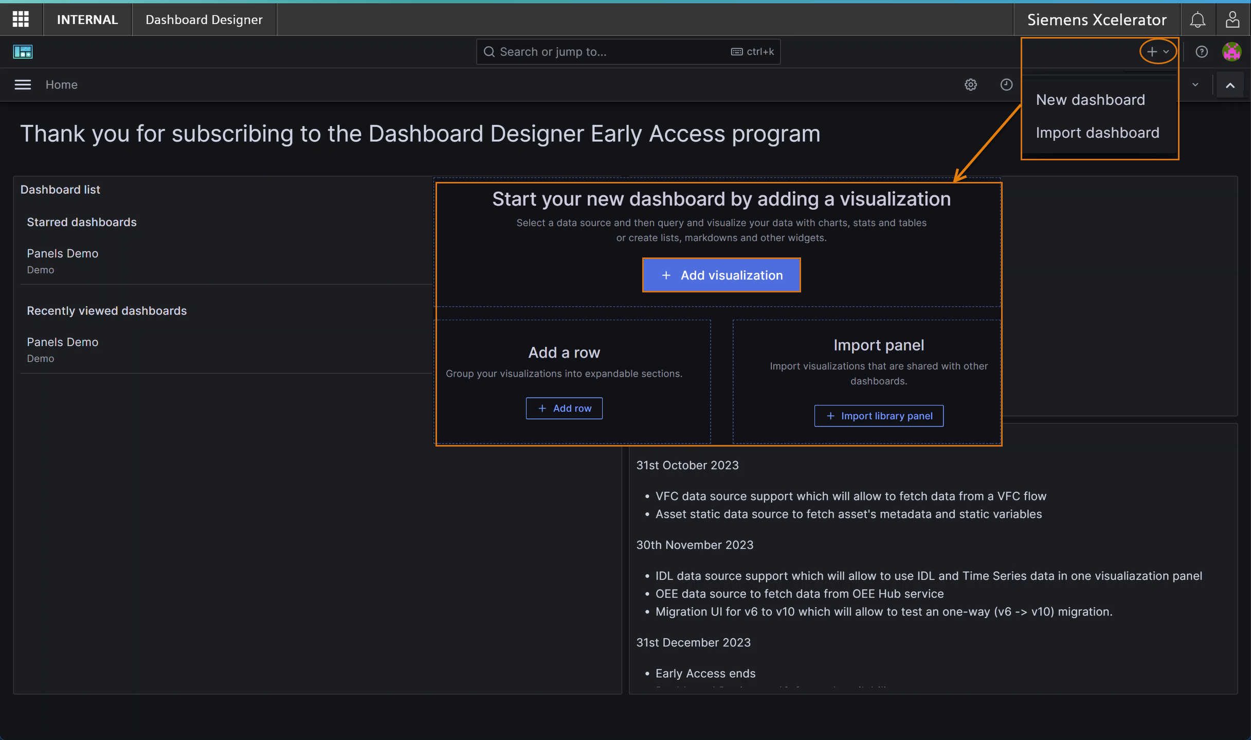
How to Add a Data Source to a Dashboard
Follow these steps to add an IoT time series data source to your dashboard:
- Click the + icon, and select "New dashboard" from the drop-down list. A pop-up window displays.
- Click the "+ Add visualization" button. Available data sources display.
- Select IoT Time Series. The data source is added and displays as Query 1 in the "Panel edit" area.
Hint
To better view all query editor selections, scroll down the page, or you can minimize the visualization by dragging up the divider bar beneath it.
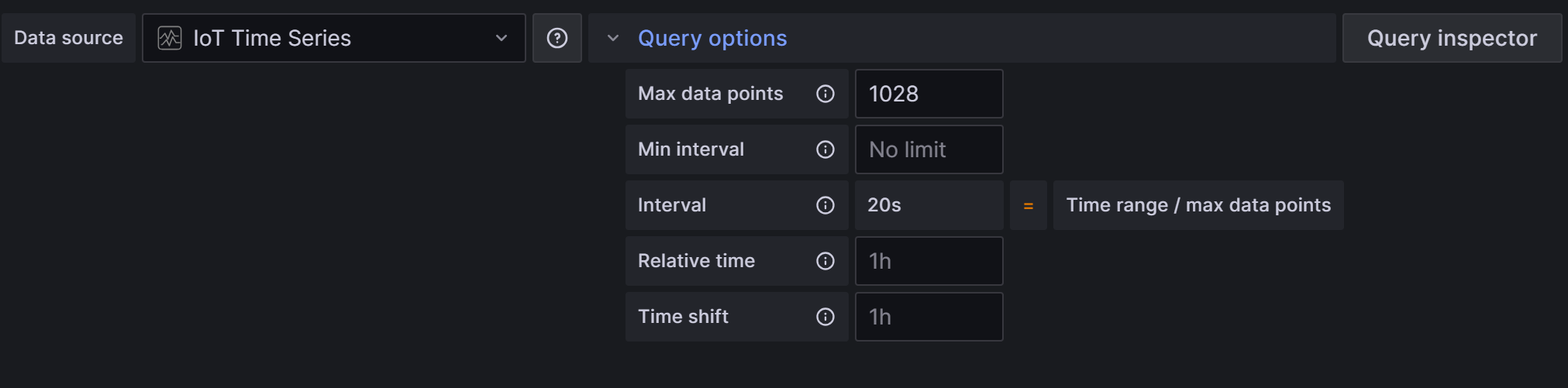
Configuring the Panel Query
Query options appear above your first query in the panel. These options apply to all queries on your panel. The info icon details can help you determine which options to use for your panel, as shown here:
There are two ways you can select data for your query: - Select options from the panel itself - Click the large 'Select' button (shown below) to open a pop-up window:
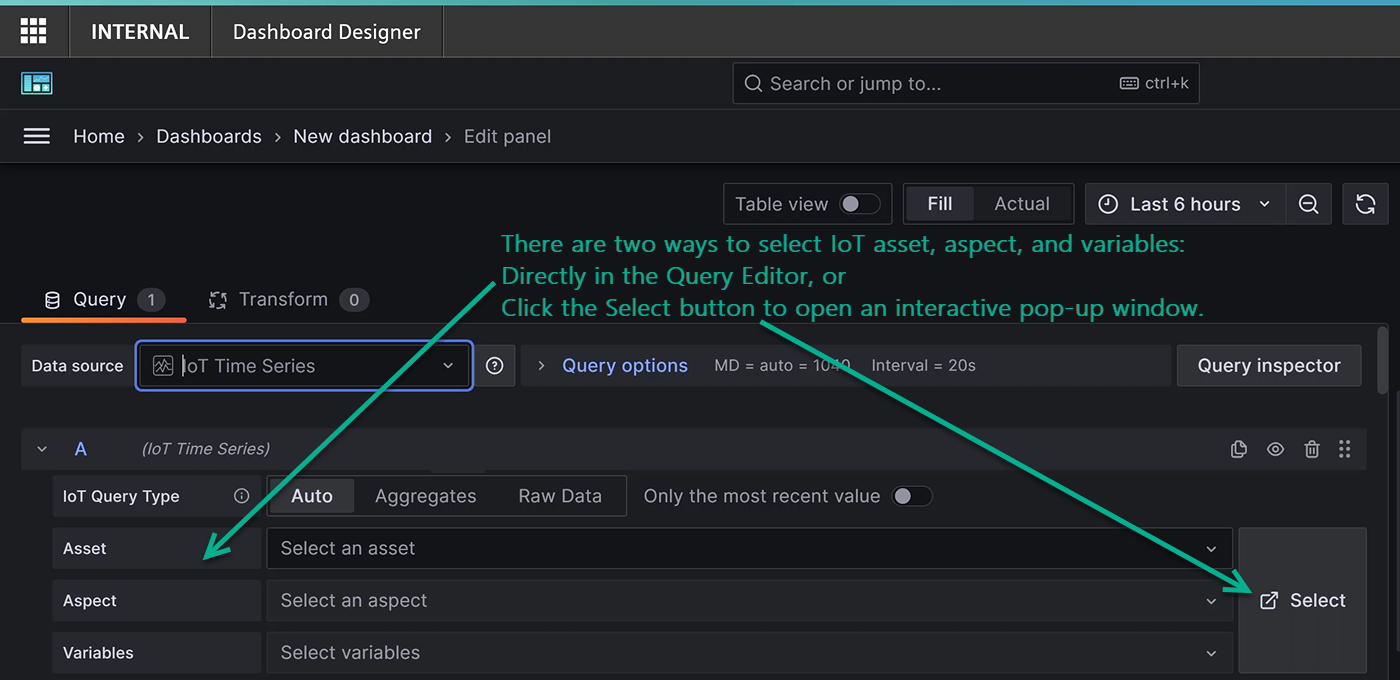
Info
The pop-up window allows you to see more of the aspects and variables available in an asset; the 'select all' feature is helpful when selecting multiple variables.
Panel Edit/Query Editor
Fine-tuning query options is crucial to harness the full potential of data visualization. This section guides you through editing your query, with introductory information for each section. Feel free to skip the intro material and jump to numbered steps.
How to Configure an IoT Time Series Query
Follow these steps to start configuring your IoT Time Series query:
- Select Auto, Aggregate, or Raw Data for your query.
- Toggle on 'Only the most recent values' if needed, and select a date range.
- Select an asset from the Asset drop-down list. The next field displays available aspects.
- Select an aspect from the Aspect drop-down list. The next field displays available variables.
- Select variables one-at-a-time from the Variables drop-down list, or use the Select All check box to use all variables.
Note
If you select the asset, aspect, and variable(s) directly in the query editor, you do not need to click the 'Select' button.
Configuring Aggregate and Time Override/Transform
Note
The transform option to increase the time range applies only to the query you're currently working with.
How to Configure Aggregate and Time Override/Transform
Follow these steps to configure the remaining options for your query:
- Click Aggregate Options (optional) to set options for unit, interval, value, whether to use the beginning or ending of timestamps, and whether or not to align boolean values.
- Click Time Override/Transform (optional) to set options for increasing the time range, shift time, value to % of time, or to group by time.
- Toggle on the 'Prefix series name with query name' if needed.
- Toggle on 'Remove subsequent duplicate values' if needed.
- Click "+ Query" to add more queries to the panel, otherwise continue to the next section Configure the Visualization. Your selections appear along the top of the Aggregate Options and Time Override/Transform sections.
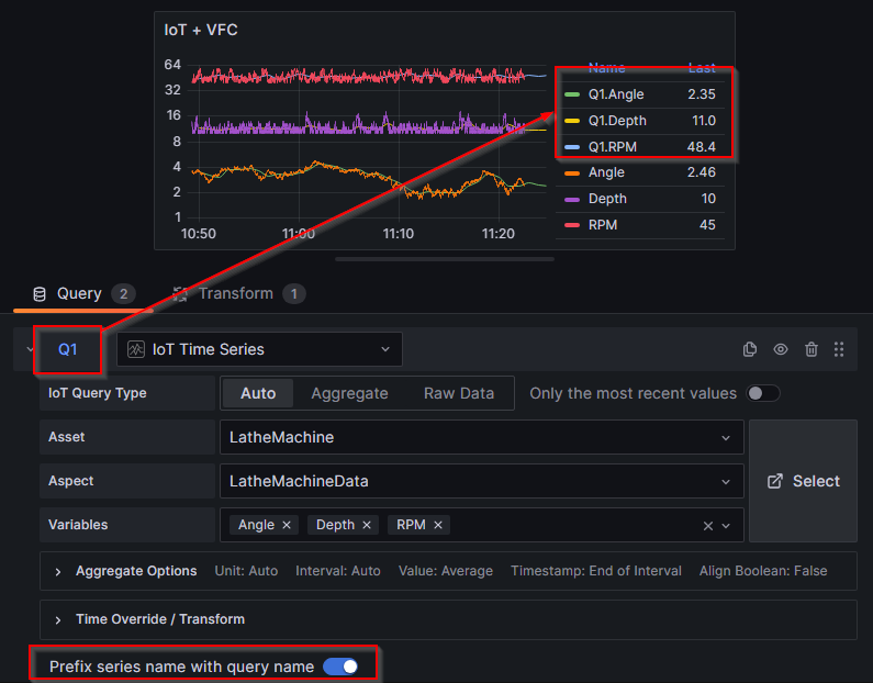
About Multiple Query Panels with Same Series Names
If you plan to add multiple queries to your panel that will produce datasets with the same series names, we recommend setting the 'Prefix series name with query name' toggle to "on".
Here is an example of when the 'Prefix series name with query name' is toggled "on":
Configuring Visualizations
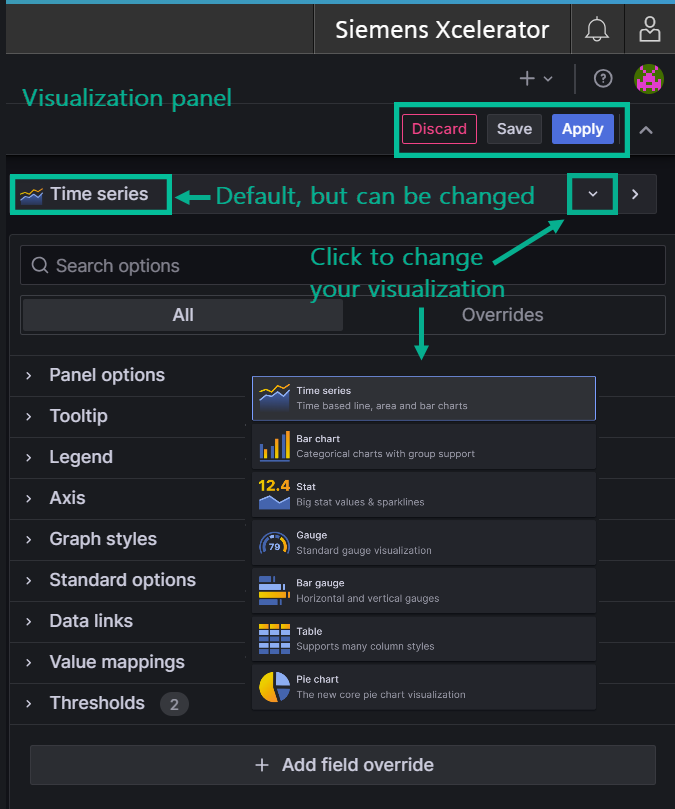
Just like each data source has certain fields that appear in the query editor, Dashboard Designer also loads the default visualization which, for the IoT data source is Time series, but this can be changed as shown in the image below. Based on your data, the suggestion tab can be helpful in exploring other visuzalizations.
Visualization Panel Overview
Dashboard Designer includes a stunning number of ways to customize and refine visualizations by specifying values for anything that appears in or on a visualization - from the colors, shapes, and lines to the data, legends, and labels.
Navigation Pointers
This image shows some navigation pointers for the Visualization panel:
The number of settings you configure in any of these sections displays next to the heading label.
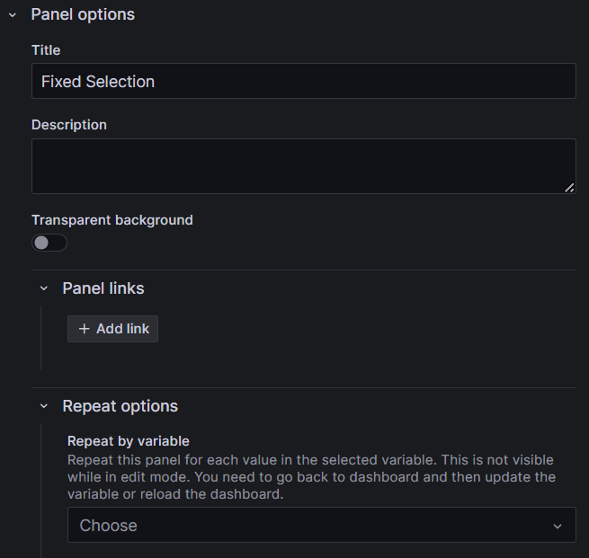
Panel Options
The first section, Panel options is where you name and optionally describe the panel and also add links, and set other preferences.
The repeat feature allows Dashboard Designer to repeatedly generate your panel for each variable of an asset or aspect you specify.
How to Configure Panel Options
Follow these steps to configure the panel options:
- Enter a title for your panel. Optionally enter a description.
- If you want the background of the panel to be transparent, set the toggle to "on".
- Click the '+ Add link' button to enter a link title, the URL, specify whether or not to open the link in a new tab, and save.
Fine-Tuning Visualizations
You can navigate through the various panel features by expanding and collapsing the sections. Each area, described briefly below offers in-depth configuration options to tailor a visualization according to analytical requirements and audience.
Tooltips
Configure visibility, sort order, and other tooltip-related settings.
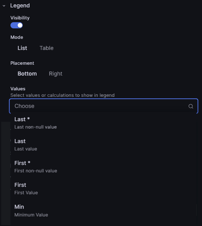
Legends
Tailor the display and positioning of the legend, choose list or table format, and select specific values to appear in the legend.
How to Configure Legend Options
Follow these steps to set legend options:
- Toggle the visibility to 'on' to display the legend on your visualization.
- Set whether to display the legend as a list or table and whether or not to place it at the bottom or right of the visualization.
- If you want to display values in the legend, select the values you want to show from the drop-down list. Your selections display in the Values field as you choose them.
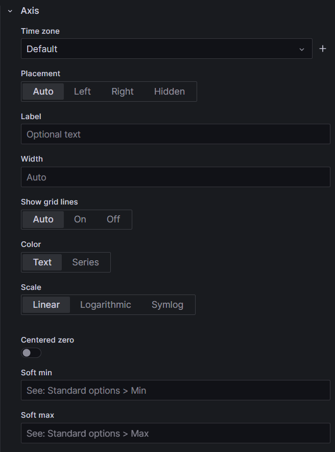
Axis Settings
Adjust visual aspects such as placement, color, grid lines, and more, related to the axes.
Here is an example of the axis settings:
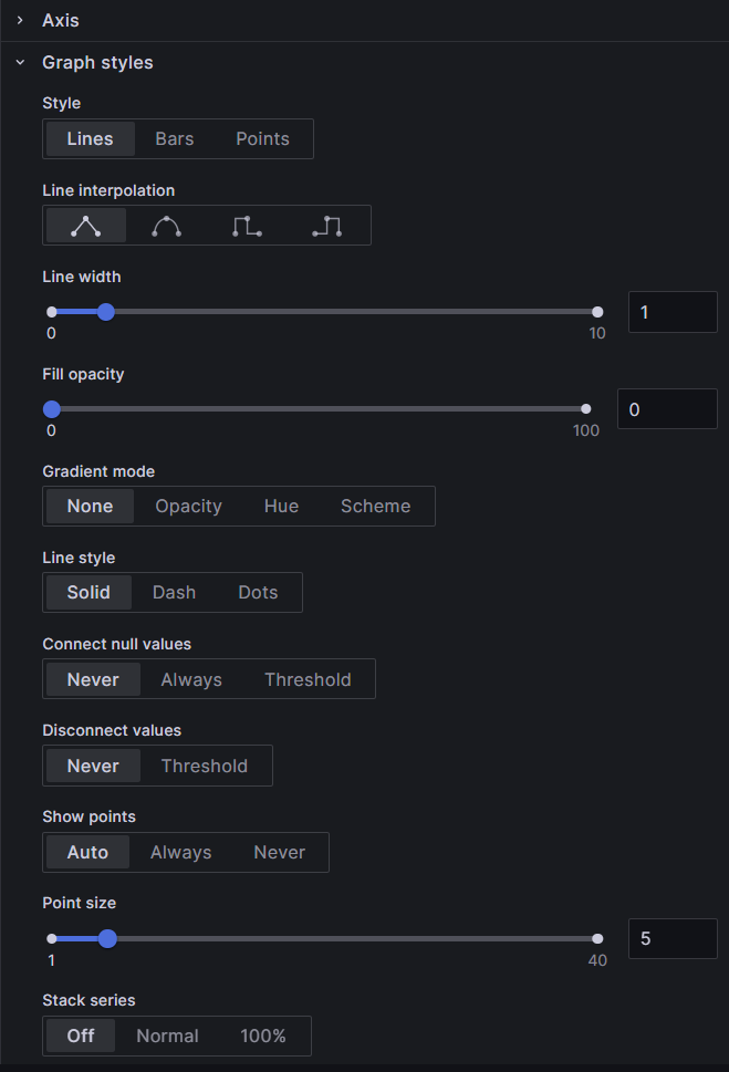
Graph Styles
Modify graph styles, including lines, bars, points, line characteristics, color, and additional visual options.
Here is an example of the graph style settings:
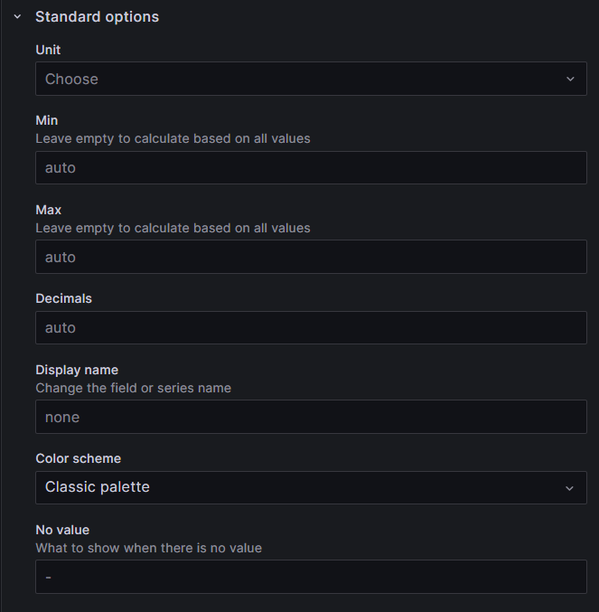
Standard Options
Customize various fields affecting the panel's appearance, such as units, color palette, min-max values, decimals, etc. The first selection, for example, is for the unit in which graph or chart data will be rendered, followed by the measurement standard, such as degrees, arc minutes, etc. for the selected unit. Other standard selections include color palette, min, max, decimals, and so on.
How to Configure Standard Options
Follow these steps to set standard options:
- Select a unit from the drop-down list. A list displays various measurement standards for the unit.
- Select the measurement to use.
- Continue to accept the defaults or make selections for the rest of the fields for your visualization.
Here is an example of the standard options:
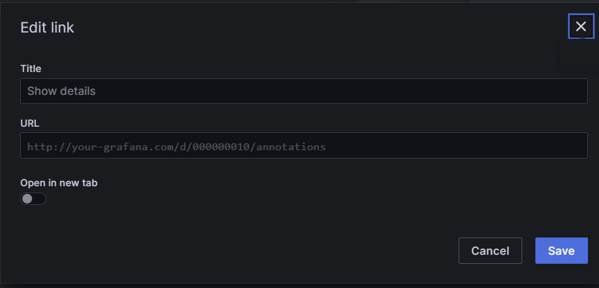
Data Links
Add and configure links to external resources relevant to the visualization. You can only set one-at-a-time.
How to Create a Data Link
Follow these steps to set data links:
- Click the '+Add link' button. The 'Edit link' pop-up window displays.
- Enter a title that will display on your panel.
- Enter the URL for the link - according to the example in the URL field.
- If you want the link to open in a new tab, move the toggle to 'on'.
- Click the 'Save' button.
Here is an example of the data links pop-up window:
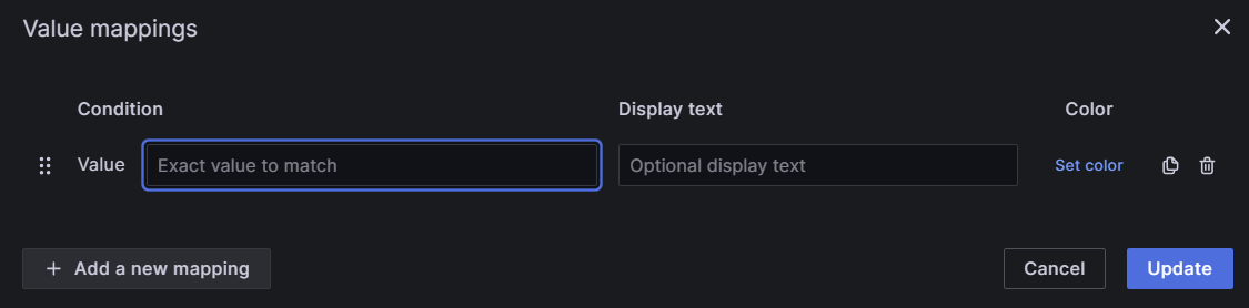
Value Mapping
Assign specific colors and optional text to values in the data set.
How to Map Values
Follow these steps to set value mappings:
- Click the 'Add value mapping' button. The 'Value mapping' pop-up window displays.
- Enter a specific value in the 'Condition' field.
- If you want the value to display in color, click the 'Set color' link. A color palette displays.
- Select a color.
- Contine to add additional mappings by clicking the '+Add a new mapping' button.
- Click the 'Update' button.
Here is an example of the value mappings pop-up window:
Threshold Options
Set thresholds for values and define display preferences for them, including absolute or percentage-based, and visualization options.
How to Configure Thresholds
Follow these steps to set threshold options:
- Click the '+Add threshold' button. A threshold row appears at the top of the thresholds list with a default value and color.
- Enter a number to replace the default value, or use the up/down arrows.
- Click the default color dot and select a color from the color palette.
- Select the delete icon to delete any threshold rows you don't want.
- Leave the 'Threshold mode' on 'Absolute', unless your threshold values are relative to min and max values; if so, slide the toggle to 'Percentage'.
- Select how you want the threholds to display from the 'Show threholds' drop-down list. (See image below).
Note
The 'Base' threshold row cannot be deleted.
Here is an example of threshold options:
Overriding Fields
Specify overrides for specific fields or field types, allowing for fine-tuning according to the data properties and queries.
You can override settings for any visualization field. Here is an example that illustrates categories of fields you can search by to locate the kind of field you want to override:
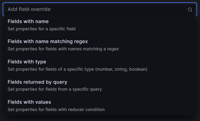
Info
The following step-by-step uses 'Fields with type', then 'Number'. The steps are the same for any of the 'field types' you select. The subsequent drop-down list displays properties relevant to the field type you select.
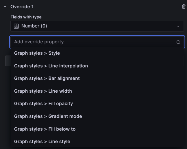
How to Override a Field
Follow these steps to configure the field override option:
- Click the '+Add field override' button. A drop-down of types displays. (Image below.)
- Select 'Fields with type'. The drop-down list closes and a 'Fields with type' label displays over a drop-down list of field types.
- Select 'Number'.
- Click the '+ Add override property' button. (Image below.)
- Select an option from the 'Add override property' drop-down list.
- Select and option from the additional values that display.
Here is an example of field override options for the 'number' field type:
Changing a Variable Name in a Visualization
Overriding and changing the display name of an IoT variable returned from a query involves modifying the variable settings.
Illustration of a Variable Name Change Visualization Panel
This shows the variable name being changed on the Time series visualization panel and the corresponding label change on the visualization:
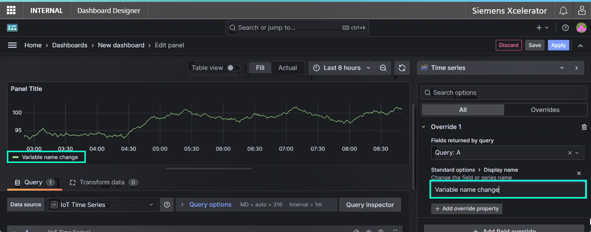
How to Change the Variable Name that Displays
Open the dashboard with the query variable you want to change and follow these steps:
- Click the '+Add field override' button as shown in the image above. A drop-down of types displays.
- Scroll and select 'Fields returned by query'. The drop-down list closes and a 'Query: A' field displays a list of variables.
- Select the variable you want to change the name of. A list of change options displays.
- Scroll and select 'Standard options > Display name'. A field opens for entering the new name for the variable.
- Enter the new name and move the cursor out of the field. The new name displays on the visualization. (image below)
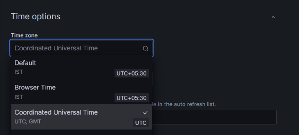
Configuring Dashboard Designer Time Zone
By default, Dashboard Designer displays data according to the browser's time range, but data from IDL and IOT are stored in UTC time range. To get optimal results when comparing data between Asset Manager and Dashboard Designer, it is recommended to modify Dashboard Designer's configuration to display data in UTC.
To change the time zone configuration, proceed with the following steps.
- Click the
 icon in the toolbar of "New dashboard" page.
 - Select Coordinated Universal Time from the Time zone drop-down list and save the dashboard.